
Title / Titel:
Society I
Size / Größe:
30 cm x 30 cm framed / m.R.
Technique / Technik:
Acrylic paint on canvas / Acryl auf Leinwand
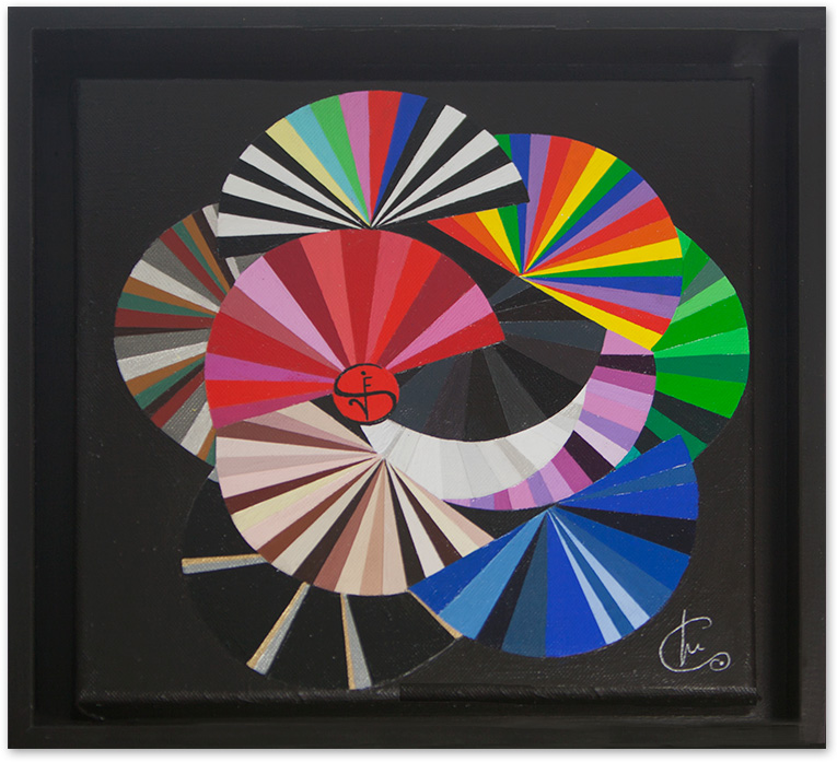
Miguela Marie Chervenak hat mit ihrem Bild “Society I“ ein Werk in einer für sie ganz ungewöhnlichen Größe geschaffen. Füllt sie sonst gerne ganze Wände, misst dieses Bild gerade einmal 26 x 26 cm. Da der Rahmen für die Künstlerin immer zum Werk dazugehört, vergrößert er das Bild auf 30 x 30 cm.
11 Fächer symbolisieren mit ihrer jeweiligen Farbwahl und Position im Bild die menschliche Gesellschaft und ihre Zugehörigkeit zu verschiedenen Gruppen. Das Geschlecht, die sexuelle oder geistige Haltung, Berufe oder Tätigkeiten sind Kategorien, die die Künstlerin malerisch mit Hilfe einer für sie plausiblen Farbsymbolik beschreibt. Es gibt den roten Fächer für Frauen, den blauen für Männer, den in bunten Regenbogenfarben für Homosexuelle, den schwarz-weiß-bunten für die Medien, den in lila gehaltenen für spirituelle Menschen und Esoteriker, den fast schwarzen für Politiker, Juristen und Polizei, während der weiße Ärzte, Heiler und die Reinheit des Lebens repräsentiert. Der Grüne steht für Natur- und Umweltbewusstsein und der schwarz-silber-goldene für die Verteilung des Geldes in der Welt.
Gemalt wurden die einzelnen Fächer als Halbkreise, die sich aus farblich aufeinander abgestimmten Kreissegmenten im jeweiligen Farbklang zusammensetzen. Dabei spielt die Künstlerin mit den Schattierungen der Fächerfarben im Sinne der Vielfalt. Für den Frauenfächer wählte die Künstlerin Rottöne von rosa bis tiefrot. Er ist nicht nur dominant oben im Bild platziert, sondern trägt am Scheitelpunkt der einzelnen Rippen ein Anagramm, bestehend aus den Buchstaben für Society. Dass gerade diesen Fächer das Anagramm ziert, gibt dem Fächer eine zusätzliche Bedeutung. Die Position der Frau in der Gesellschaft wird aufgewertet, außerdem gehörte der Fächer viele Jahrhunderte zur Garderobe der Frau. Wortlos, nur mit Gesten und seiner Stellung in der Hand, diente er der Kommunikation. Durch die Anordnung des Fächers im Bild mit seiner leichten Schrägstellung klingt auch eine gewisse Koketterie an.
Die Symbolik der Farben für die einzelnen Typen unserer Gesellschaft ist Miguela Marie Chervenak ebenso wichtig wie das Verhältnis der einzelnen Gruppen zueinander. So platzieren sich die Fächer für Männer und Frauen einander gegenüber, der rote oben, der blaue unten. Erstaunlich. Beide werden nicht von anderen überlagert, bilden sie doch die Basis der Gesellschaft. Betrachtet man das Bild unter diesem Aspekt, fällt die Sonderstellung der Medien auf. Während alle Fächer mehr oder weniger von einem oder mehreren überschnitten werden, thront der Medienfächer unverdeckt über allen. Damit will die Künstlerin zum Ausdruck bringen, wie sehr die Medien die Gesellschaft beeinflussen. Die Farben des Fächers ergeben sich aus der Farbzusammenstellung des Testbildes, das früher in Pausen auf dem Bildschirm des Fernsehers eingespielt wurde.
Der untere schwarz-silber-goldene Fächer symbolisiert die Verteilung des Geldes auf der Welt. Gold und Silber für Ober- und Mittelschicht nehmen nur wenig Platz auf dem Fächer in Anspruch. Die Armen der Welt sind in schwarz gehalten. Durch das zahlenmäßige Übergewicht armer Menschen erhält der Fächer nicht nur breite schwarze Streifen, sondern auch seine Position ganz unten im Bild. Das leicht glänzende Schwarz der Armut geht in das matte Schwarz des Hintergrundes über. Schwarz steht für die Künstlerin nicht nur für finanzielle Armut, sondern auch für Armut im spirituellen, seelischen, emotionalen, moralischen und empathischen Sinn.
In Zeiten von Kriegen, Terrorismus, Flucht und Vertreibung ist das Gemälde „Society“ von Miguela Marie Chervenak viel mehr als ein Spiel mit Farben und Formen. Es fordert auf, genauer hinzusehen und sich Gedanken über uns als Gesellschaft zu machen. Das Bild passt in unsere Zeit.
August 2016
Dr. Bettina Broxtermann
| Roter Fächer | Frauen, Liebe, Wärme aber auch Aggression und Geschwindigkeit |
| Blauer Fächer | Männer, Ruhe, Kälte, aber auch für „Blaumänner“ und Arbeit unter freiem Himmel. |
| Schwarzer Fächer | Politiker, Juristen, Polizei und der Spezialeinheiten sowie für den Tod |
| Weißer Fächer | Ärzteschaft, für (spirituelle) Heiler für Helligkeit und Reinheit und das Leben |
| Lila Fächer | Spiritualität und für Esoteriker. (Im Bild bekommt er die Position neben dem weißen Fächer) |
| Grüner Fächer | Für die Natur, für Umweltbewusstsein und alle, die sich dafür einsetzen |
| Regenbogenfächer | Homosexuelle |
| Schwarz / weiße / bunte Fächer | Für die alles beherrschenden Medien. Die Position im Bild ist wichtig, da die Medien als Meinungsmacher „über allem“ stehen. Das schwarz/weiß versinnbildlicht „Print“ in Papier oder online und die bunten Farben als Zeichen für das alte TV Testbild für Fernsehen, aber auch PC und Kino. |
| Stahlfarbene / perlweiß / altrot / altbraun / altgrüne Fächer | (Linke Seite neben dem Medien Fächer) steht für die Wissenschaften. Stahl steht für die Industrie (Roboter/Autos/Häuser), perlweiß hier für alles von „apple“, der Mac, der iPhone etc. und die altrot/altbraun/altgrünen Farben meinen alte in Leder gebundene Bücher. |
| Hautfarben Fächer | Von schneeweiß über gelblich und rötlich bis afrikanisch schwarz. Er ist zwischen dem Fächer für Männer und Frauen positioniert. |
| Schwarz / silber / goldener Fächer | Die Verteilung des Geldes in der Gesellschaft. Zwei kleine dünne goldene Streifen meinen die super Reichen, zwei etwas dickere silberne Streifen die Mittelschicht und die Armen der Welt sind in schwarz gehalten. Durch das Übergewicht der Armut erhält der Fächer seine Position ganz unten im Bild. |
In creating her “Society I” painting, Miguela Marie Chervenak has created a work of art in a size that is highly unorthodox for her. While she’s usually keen to cover entire walls, this painting measures merely 26 x 26 cm. Because the frame is always an integral part of the work of art to her, it increases the size of the piece to 30 x 30 cm.
Eleven fans symbolize human society and its affiliation with different groups through the artist’s choice of colors and the fans’ position within the piece. Gender, sexual and spiritual views, professions or activities are all categories that the artist picturesquely describes using color symbolism that is entirely conceivable for her. There’s the red fan for women, the blue one for men, one in colorful rainbow colors for homosexuals, a black-and-white fan for the media, one in purple for spiritual people and esoterics, another fan that’s almost black for politicians, legal practitioners and the police, and a white one to represent doctors, healers and the purity of life. The green fan stands for awareness of nature and the environment, while the black, silver and gold fan stands for the distribution of money in the world.
The individual fans were painted as semi-circles made up of color-coordinated segments in the relevant color tone. The artist plays around with the hues of the fan colors to add a diverse touch to the piece. For the women’s fan, the artist chose to use red tones ranging from pink to deep red. Not only is it in a dominant position at the top of the painting; at the head where the individual leaves come together, the fan features an anagram of the word “Society”. The fact that the anagram is on this particular fan gives it more meaning. The woman’s position in society is being elevated, and the fan was part and parcel of her wardrobe for many centuries too. Women used their fans silently to communicate through movement and the way they held them in their hands. The fact that the fan is positioned at a slight incline in the piece also conveys a certain degree of flirtatiousness.
For Miguela Marie Chervenak, the symbolism of the colors used for the individual types of our society is just as important as the individual groups’ relationship with one another. That’s why the fan for men and the fan for women are positioned opposite one another, with the red one at the top and the blue one at the bottom. Which is rather surprising, to be honest. While neither of them overlap with one another, they form the foundation of society. If you look at the piece from this angle, the special position allocated to the media is very striking. While every single fan is more or less covered by one or more of the others, the media fan is positioned uncovered above all the rest. The artist has done this to express how much the media influence society. The fan’s colors are taken from the colors used in the test pattern previously used on the television during breaks.
The black, silver and gold fan symbolizes the distribution of money in the world. The gold and silver used to symbolize the upper and middle classes take up very little space in the fan. The poor of the world are depicted in black. Given that there are far more poor people in the world, not only does this fan contain thick black segments; it is also positioned right at the bottom of the piece. The slightly glossy black used to convey poverty merges into the matt black color of the background. For the artist, black doesn’t just represent financial poverty, but also poverty in the spiritual, mental, emotional, moral and empathetic sense.
In times of war, terrorism, exodus and displacement, Miguela Marie Chervenak’s painting “Society” is far more than just an interplay of colors and shapes. It prompt us to take a closer look at things and to think about our society. The piece is very much in tune with our times.
August 2016
Dr. Bettina Broxtermann
| Red fan | Women, love, warmth, but also aggression and speed |
| Blue fan | Men, tranquility, coldness, but also “blue-collar workers” and outdoor work |
| Black fan | Politicians, legal practitioners, police and the special units, as well as death |
| White fan | Medical professions, (spiritual) healers, brightness, purity and life |
| Purple fan | Spirituality and esoterics (positioned next to the white fan in the picture) |
| Green fan | Nature, environmental consciousness and all those who promote it |
| Rainbow fan | Homosexuals |
| Black / white / colorful fan | The all-dominant media. Its position in the piece is important because the media is “above all else” as the opinion leader. The black and white colors epitomize paper or online print media, while the bright colors symbolize the old TV test pattern, as well as computers and the cinema. |
| Steel-colored / pearl white / ancient red / ancient brown / ancient green fan | (On the left next to the media fan); stands for the sciences. Steel stands for industry (robots / cars / buildings) and pearl white reflects everything from Apple (the Mac, the iPhone, etc.); the ancient red / ancient brown / ancient green colors, meanwhile, depict old leather-bound books. |
| Skin-colored fan | From snow-white, yellowish and reddish to African black. Positioned between the fan for men and women. |
| Black / silver / gold fan | The distribution of money in society. Two little narrow gold stripes are evocative of the super-rich; two slightly thicker silver stripes refer to the middle class, and the poor of the world are depicted in black. Given that there is far more poverty in the world, this fan is positioned right at the bottom of the piece. |